The menu page is a critical aspect of any ecommerce mobile app. It serves as the gateway for customers to navigate to different product categories and collections, as well as access other important features like account information, the cart, and settings, making it easier for users to navigate the app and find what they need. Therefore, it is essential to design a menu page that enhances the user experience and drives engagement.
However, designing a menu page that is user-friendly and intuitive can be challenging. To create a menu page that meets the needs of users, designers must take a user-centered approach that prioritizes user needs and preferences. In this blog, we’ll discuss some tips and tricks for designing a menu page that puts users first.
What Makes a Good Menu Page for Ecommerce Mobile Apps?
A good menu page for ecommerce mobile apps should be user-friendly, intuitive, and easy to navigate. Here are some key elements to keep in mind:
- Prioritize Navigation: The menu should prioritize navigation to the different product categories and collections, as well as important features like account information, cart, and settings. This can be achieved by placing these options at the top of the menu.
- Keep It Simple: The menu should be simple and easy to understand. Avoid using too many options or categories, as this can overwhelm users.
- Organize Effectively: Organize the menu in a logical and intuitive manner. Consider grouping similar categories together, and using sub-menus for more specific options.
- Be Consistent: Use consistent design and terminology throughout the menu. This can help users understand and navigate the menu more easily.
- Use Real User Feedback: Finally, the best way to ensure that your menu page is user-centered is to use real user feedback. Conduct user testing and gather feedback on the menu’s design, ease of use, and overall user experience. Use this feedback to iterate and improve the menu page continually.
Types of Menus for Ecommerce Mobile Apps
There are several types of menus that can be used for ecommerce mobile apps. Here are a few examples:
- Hamburger Menu: This is the most common type of menu for mobile apps. It consists of three horizontal lines that can be tapped to reveal a drop-down menu.
- Tab Bar Menu: This type of menu is located at the bottom of the screen and consists of several tabs that can be swiped or tapped to navigate to different sections of the app.
- Icon-Based Menu: This menu uses icons instead of text to represent different categories and features. This can be useful for apps that have a lot of categories or features, as it can help simplify the menu.
Best Practices for Designing a Menu Page for Ecommerce Mobile Apps
Here are some best practices to keep in mind when designing a menu page for ecommerce mobile apps:
- Catalog the Menu: Create a list of all the categories and features that will be included in the menu. This can help you organize the menu more effectively.
- Arrange the Menu: Organize the menu in a logical and intuitive manner. Consider grouping similar categories together and using sub-menus for more specific options.
- Use a Search Bar: Include a search bar in the menu to help users quickly find what they are looking for.
- Use Visuals: Use visuals like icons and images to make the menu more visually appealing and easier to understand.
- Test and Iterate: Conduct user testing and gather feedback from customers to understand their needs and preferences. Use this feedback to make improvements to the menu.
Noteworthy Examples of Well-Designed Menu Pages in Top Ecommerce Mobile Apps
Here are some examples of well-designed menu pages in top ecommerce mobile apps:

- Adidas
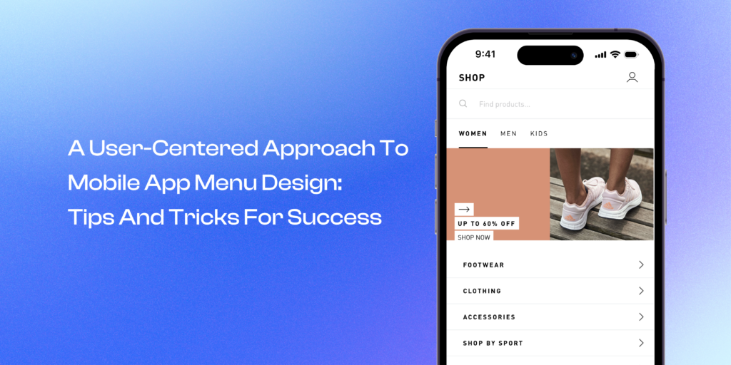
Adidas’s menu page is accessible from the navigation tabs of the app, and when opened, it features both search and menu using a simple layout, with search at top and then categories like Men, Women and Kids with collections like footwear, clothing, accessories and sale below the search

- Amazon
Amazon’s menu page features a simple and intuitive layout, with categories like Shop By Department and Your Account at the top of the menu. The use of visuals and icons also helps to make the menu more user-friendly.

- Zara
Zara’s mobile app has a super minimally designed menu page that is subtle and visually appealing, with categories like men, women, kids, and beauty as horizontal sections and other collections and subcategories within, making it easy for the users to find what they’re looking for quickly.
Conclusion
Designing a good menu page for ecommerce mobile apps is essential for creating a seamless user experience and driving engagement. By prioritizing navigation, keeping it simple, organizing effectively, being consistent, and using real user feedback, you can create a menu page that meets the needs of your target customers. By using best practices like cataloging the menu, arranging the menu logically, using a search bar, using visuals, and testing and iterating, you can ensure that your menu page is user-friendly and effective. Look to the examples set by top ecommerce mobile apps like Amazon, Etsy, and Sephora to inspire your own design.


No Comments
Leave a comment Cancel