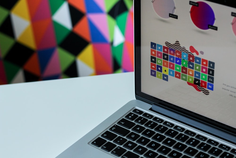
Building stellar visual elements for your eCommerce website is one of the effective approaches to improving your customer experience.
Ways to improve customer experience
This checklist enlists the major visual components in an eCommerce website that determines the customers’ delight from an optimization point of view.
List of visual elements to improve customer experience
A checklist to improve customer experience equips you with some last-minute ideas to improve the aesthetical quality of your eCommerce website’s visual components for better customer experience.

1. Logo
A logo is what encapsulates your brand identity. Make sure that you place your company’s logo on the top left. The most visible part of a page is the topmost section and it is wise to make use of this part which draws the eyes. Ensure that you:
- Place the logo on the topmost corner
- Place it above the text
- Add a tagline below the logo, if applicable
2. Font
Display of a unique brand identity directly shows off your credibility and this is a major player in increasing the customer experience. Throughout the website, the fonts should be chosen from your brand family or design scheme so that it is consistent.
Following are some common font pairings, according to mageplaza:
- Crimson Text Regular and Source Sans Pro Regular
- Lato Light and Lato Regular
- Luckiest Guy and Bitter Regular
- Montserrat Bold and Roboto Regular
- Raleway Bold and Source Code Pro Regular
Additionally, assign and use different fonts to help differentiate between heading, body text, and other elements of content in the page such as links and navigation. Also, this helps your customers understand your website in a better way.
3. Color
Primarily, follow the psychological characteristics of colors to enhance the effect. For instance, use suitable colors for different products. Customers should be able to attribute each color used in your website. For example, colors of function, colors of calls for action, etc.
4. Product Images
Product images give your customers a virtual idea of the products they are going to buy. Specific and high-quality images of products earn customer attention. Also, the following are some ideas for optimizing product images for eCommerce websites:
- Upload photos of products from different angles. Customers would like to view the products to check the quality and functionality
- Use product videos exposing its functionality
- Set hover effect to showcase different product images
- Provide in-use images to establish the product function
- Display user-generated product images and images with people
Optimizing the Visual Elements
In addition to this, check out some of the SEO considerations to ensure optimization of the images used in your eCommerce website and improve customer experiences:
- Include alt text
- Have an appropriate name for URLs and context purposes
- Have a smaller file size for faster loading
Likewise, the product page must also be optimized in order to attract customers and improve conversion rates. Therefore, a quick reference checklist to add to the above-mentioned visual strategies to improve customer experience will be bonus content at this point. Check it out:
- Title tags
- Content in the product page
- A description with keyword-rich
- Alt tags
Final word
In conclusion, visual appeal is a key influencing factor that draws customers into your online store. Use the above checklist to boost the customer’s delight and win their hearts!
Already a WooCommerce store owner? Build a Mobile App to Win More Customers
Appmaker specialises in Quality and Performance guaranteed, E-Commerce Android/iOS Apps for E-Commerce Businesses. Get in touch


No Comments
Leave a comment Cancel